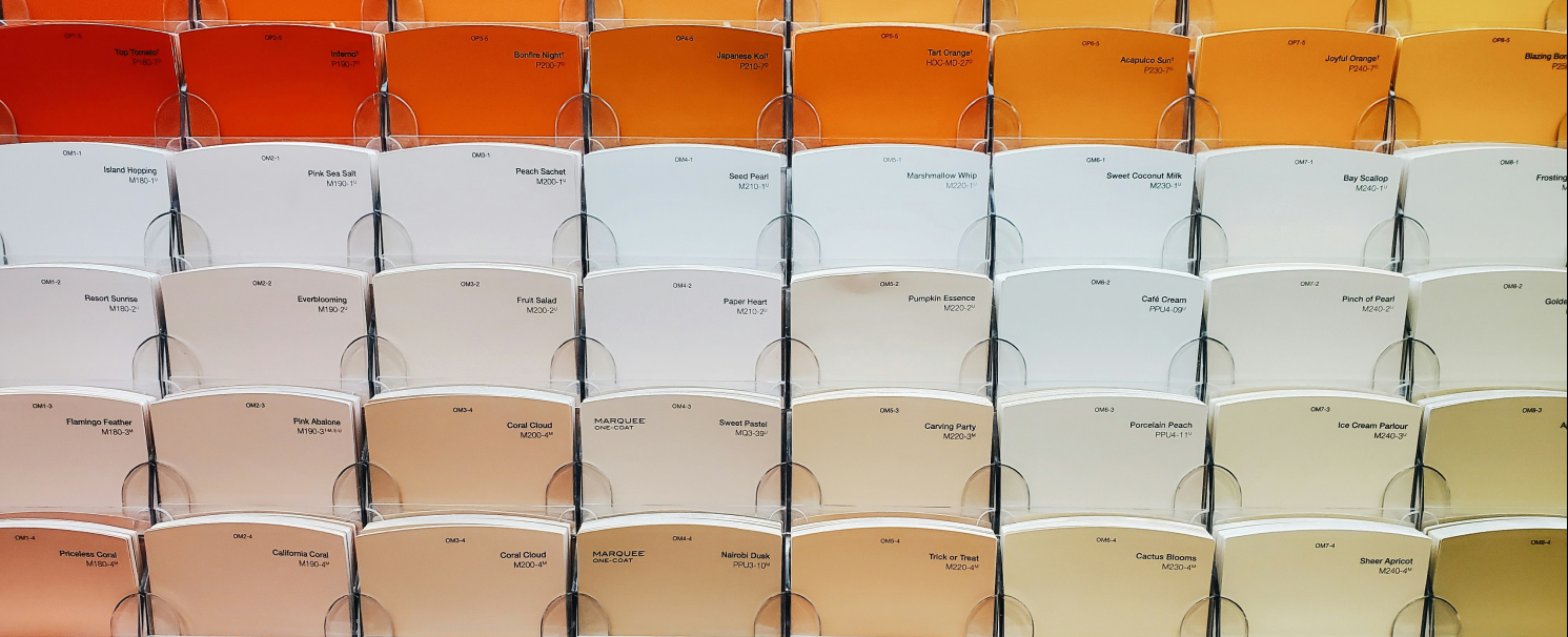
In the realm of design, colour is not a mere flourish. It’s a powerful tool that speaks volumes to consumers on a subconscious level. Colour relates to your personality and encourages behaviour. And brands use the psychology of colour to do just that. It’s the silent salesman, the subtle influencer that speaks to your customers.
I find often while partnering with business owners on a logo or packaging design, it’s not always a well thought out decision:
“I loveee purple. Can you add some purple to the logo?”
Here’s why you don’t want to base crucial business decisions on a whim. Base it on proven research.
Colour transcends mere Aesthetics
When choosing a colour for your brand, think about what sets you apart from the competition and how you want to be perceived by your ideal customers. Your brand colour gives them a sense of what you stand for.
Check out this Colour Psychology Breakdown
Consider red, the clarion call of colours. It’s not just a signal of stop signs and fire trucks; it’s the drumbeat of urgency, the hue of passion that stirs the soul. When a brand employs red, it’s not just choosing a colour—it’s choosing to be heard.
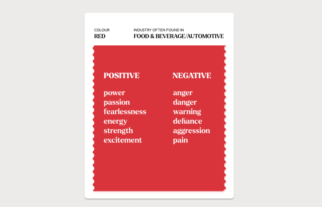
Image by Karaki Design Lab
Orange, with its citrus-infused vibrancy, is the handshake of colours. It’s friendly, inviting, and exudes a sense of fun. It’s the colour that says, “Let’s talk business,” without uttering a single word.
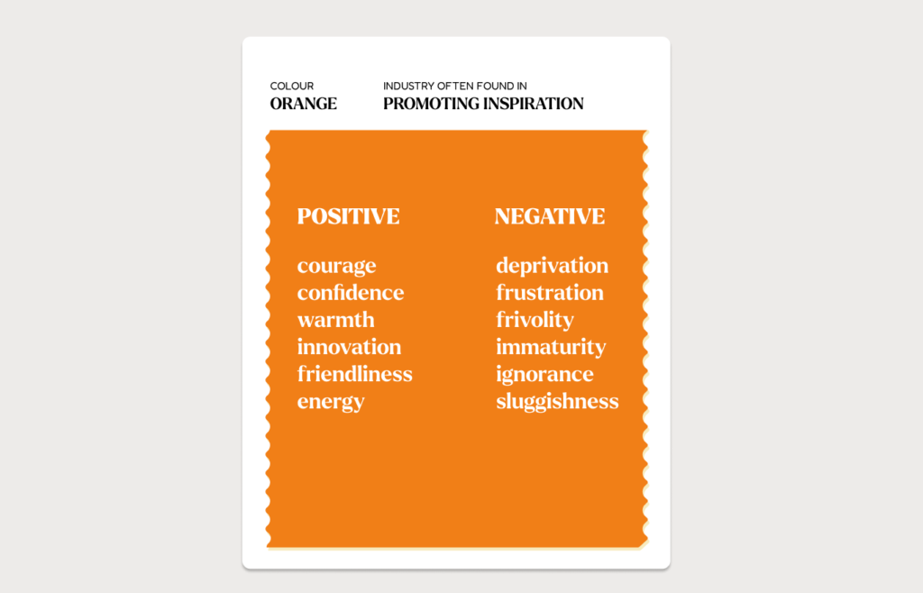
Image by Karaki Design Lab
Yellow, the sunshine in the palette, radiates optimism and clarity. It’s the colour of ideas, innovation, and enlightenment. Brands that bask in yellow are bathed in the glow of positive energy.
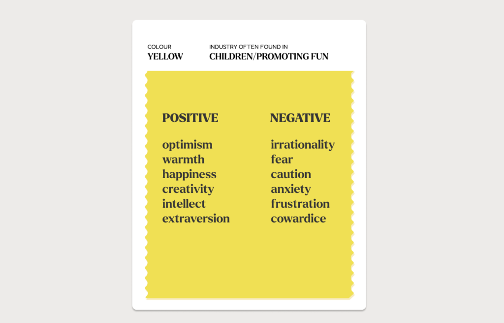
Image by Karaki Design Lab
Green, the colour of growth and renewal, speaks of balance and harmony. It’s the go-to hue for brands that wish to be synonymous with nature, health, and tranquility.
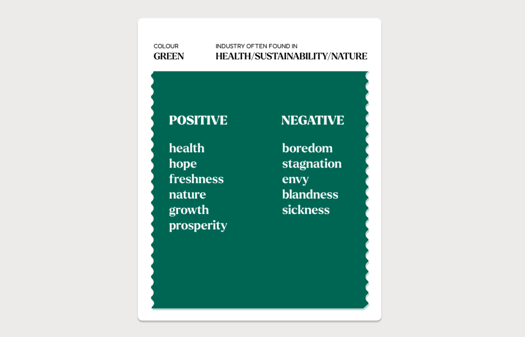
Image by Karaki Design Lab
Blue, the most beloved of corporate colours, exudes trust, authority, and calm. It’s the suit and tie of the colour world, the boardroom’s choice for credibility.
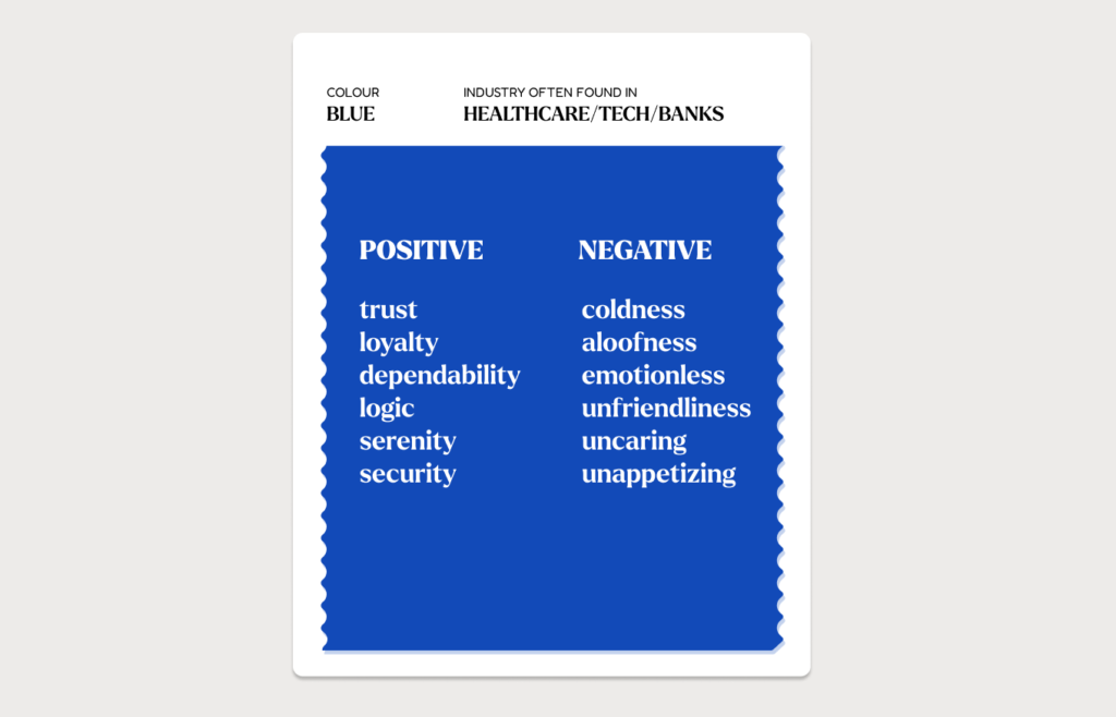
Image by Karaki Design Lab
Purple, the regal representative, whispers of luxury and wisdom. It’s the colour that drapes brands in a cloak of sophistication and mystery.
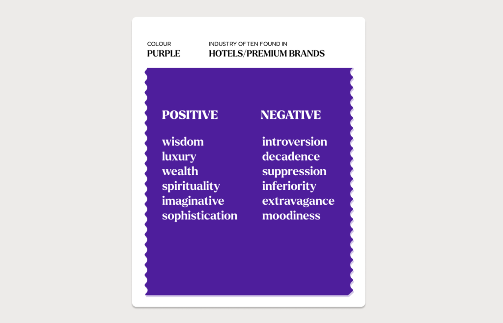
Image by Karaki Design Lab
Colour is your Strategic Partner
So, as you craft your brand’s visual identity, remember that colour is the difference between blending in and standing out. It’s not just a colour. It’s a behaviour, a strategy, a key to unlocking the potential of your brand:
1. Think about what emotions you want to invoke in your target audience.
2. Use colour to stand out in amongst competitors
3. Be consistent to increase brand recognition
Embrace the psychology of colour. Let it guide you to a palette that doesn’t just represent your brand but resonates with your audience. Because when you speak the language of colour fluently, the world doesn’t just see your brand—it feels it.
